Zethcon, a provider of modern warehouse software for the 3PL and distribution markets, reached out to Koroberi for help in refreshing its brand. As an industry leader for fifty years, the company has a longstanding history of advancing its technologies and services to keep up with the pace of today’s supply chains. But their brand didn’t reflect that innovation.
In hopes of growing their business and expanding their targets, Zethcon wanted a fresh face that didn’t jeopardize the brand recognition they’d worked for decades to establish. Koroberi was tasked with refreshing their company and product messaging and evolving their logo that would both uphold their legacy and accommodate growth for years to come.
Simplicity and consistency in messaging
We started by doing our research. We read through all of Zethcon’s existing marketing materials, held interviews with various departments in the organization and asked our industry partners and colleagues about their understanding of the company. We researched top competitors, identifying consistent messages and opportunities for differentiation.
One of the biggest branding challenges we identified upfront was prioritizing Zethcon’s brands. Zethcon only has one product, a warehouse management system (WMS) called Synapse. It’s a well-recognized and respected product, so some customers mistakenly associate the brands 1:1 and refer to the company as Synapse. To help communicate proper hierarchy and allow for future product offering expansion, we recommended always referring to the software as “Synapse WMS from Zethcon” on first reference and “Synapse WMS” in all later references – clearly calling it out as a warehouse software product in every use.
And then we went to the messaging drawing board. We workshopped the ideal Zethcon business prospects, both from a demographic perspective (industry, size, geographic reach) and from a company characteristic perspective (goals, challenges, current software solutions used, operational workflows, etc.). We needed to answer the questions: “What does this ideal prospect need from a software partner?” and “How does Zethcon deliver on those needs?” We distilled it into three simple foundational elements – dedication, knowledge and nimbleness. Those were the three messages that would drive all future communications about the company and be the basis for their refreshed logomark.
Dedication
Knowledge
Nimbleness
Small design changes for big impact
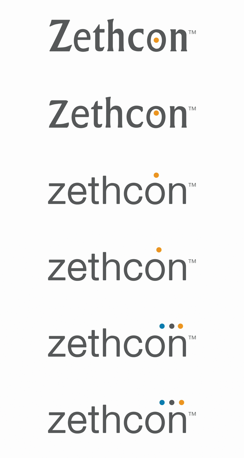
The new logo is comprised of a sans-serif font and lowercase letters. Since the first iteration of the Zethcon logo, technology has advanced and it’s crucial to have an up-to-date and functional online presence. The sharp edges and clean lines of sans-serif fonts are more suitable and legible on-screen. Sans-serif fonts also provide a more approachable and welcoming disposition, something that is increasingly important in building relationships with today’s businesspeople.
The three dots positioned above the name represent Zethcon’s foundational characteristics – dedicated, knowledgeable, nimble – while simultaneously serving as a vehicle to drive more color into the design. They add a bit of dynamism to a simple base, while still retaining its classic qualities. The dots also translate as periods, as in “All you need is Zethcon. Period.”
A platform that stands the test of time
The next step was to apply all of these learnings from the Zethcon rebrand to its Synapse WMS product. We needed to answer: “What does Zethcon’s ideal prospect expect from a software solution, and how does Synapse WMS provide that?” We kept coming back to the same three elements – configurability, comprehensiveness and proven success – that would be the foundation for all sales conversations and marketing content in the future. We applied the new look and feel to their Synapse WMS product logo, clearly tying the offering to the simplicity and strength of the master Zethcon brand, yet creating something strong enough to stand alone and versatile enough to accommodate future growth plans.